Last year when working for a large organisation i was designing a new layout for various modes of touch screen technology. Mobiles, tablets and decided to check what font sizes were being used and in the development process, usually three different sizes for small, medium and large. These sizes correspond to mobiles being small, tablets medium and large for desktop etc.. This is the normal process behind front end frameworks. But sometimes when looking at certain websites you may think are my eyes getting worse? or it could just be that the designer didn’t take the correct font size into consideration when looking at smaller devices.
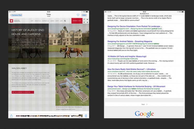
My experimentation went like this; first i used a tablet and took a screen shot of google search results page, i then used this to compare what was currently being offered by the foundation framework and doing the same thing again. Take a screen shot of the newly designed page, this is an accurate way to know what kind of reading experience your users will have. Of course you will need to do this at least on a mobile and a tablet but the more devices used the better.